Introduction
Brushes and pens are objects used to draw and fill graphics objects. In this article, I will discuss various types of brushes available in XAML and WPF model, their members, and properties and how to use them in your applications.
WPF and XAML work together and there is an WPF class corresponding to each XAML control. For example, <SolidColorBrush> tag in XAML and SolidColorBrush class in WPF, both represent the solid color brush. You can create and use brushes in both ways seperately or mix them. For example, I can create a brush using XAML and then later set the same brushes property dynamically in my coding using WPF class model.
In XAML and WPF model provides following brush objects -
- SolidColorBrush
- LinearGradientBrush
- RadialGradientBrush
- DrawingBrush
- Visual Brush
- ImageBrush
1. Solid Color Brush
The <SolidColorBrush/> represents the solid color brush in XAML. The Color attribute of the tag represents the color used in the brush. For example, the following code creates a solid color brush with blue color.
<SolidColorBrush Color="Blue" />
The Color attribute can also be a hex value instead of the color name. The following code uses hex value of a color.
<SolidColorBrush Color="#FFFFFF" />
The following code fills a rectangle with black color.
<Rectangle Width="200" Height="40" Stroke="Blue" StrokeThickness="1">

<Rectangle.Fill>

<SolidColorBrush Color="#000000" />

</Rectangle.Fill>

</Rectangle>

Figure 1. Rectangle with a solid brush
2. Linear Gradient Brush
The <LinearGradientBrush> object represents the linear gradient brush in XAML.
<Rectangle Width="200" Height="40" Stroke="Blue" StrokeThickness="3">

<Rectangle.Fill>

<LinearGradientBrush>

<GradientStop Offset="0" Color="Red"/>

<GradientStop Offset="1" Color="Green"/>

</LinearGradientBrush>

</Rectangle.Fill>

</Rectangle>

Figure 2. Rectangle filled with a linear gradient brush.
3. Radial Gradient Brush
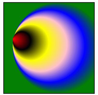
The <RadialGradientBrush/> represents the radial gradient brush in XAML. Radial gradient brush provides gradient similar to linear gradient brush, however a linear gradient brush has a start point and end point and blending is done from the start and ending, while radial gradient brush has a circle.
In a radial gradient brush, you specify the gradient origin, center, and circle's X,Y radus values and GradientStop attribute specify the color of the graident.
The following source code draws a rectangle and fills with a radial gradient brush with multiple colors.
<Rectangle Width="300" Height="300" Stroke="Black" StrokeThickness="2">

<Rectangle.Fill>

<RadialGradientBrush GradientOrigin="0.1,0.4" Center="0.6,0.5" RadiusX="0.5" RadiusY="0.5">

<GradientStop Color="Red" Offset="0" />

<GradientStop Color="Black" Offset="0.20" />

<GradientStop Color="Yellow" Offset="0.40" />

<GradientStop Color="Pink" Offset="0.60" />

<GradientStop Color="Blue" Offset="0.80" />

<GradientStop Color="Green" Offset="1.0" />

</RadialGradientBrush>

</Rectangle.Fill>

</Rectangle>

Figure 3. Rectangle filled with a radial gradient brush
4. Drawing Brush
Drawing Brush is a new addition to the brush types since GDI+. A Drawing Brush can be used to paint an area with shapes, text, images, and even video. The <DrawingBrush/> represents the drawing brush in XAML. A Drawing Brush uses drawing objects GeomertyDrawing, ImageDrawing, VideoDrawing, and GylphRunDrawing to draw shapes, images, video, and text respectively.
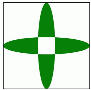
The following code uses a DrawingBrush to fill two ellipses. I will cover DrawingBrush objects, its methods and properties in more details in my seperate article.
<Rectangle Width="300" Height="300" Stroke="Black" StrokeThickness="2">

<Rectangle.Fill>

<DrawingBrush>

<DrawingBrush.Drawing>

<GeometryDrawing Brush="Green">

<GeometryDrawing.Geometry>

<GeometryGroup>

<EllipseGeometry RadiusX="0.1" RadiusY="0.5" Center="0.5,0.5" />

<EllipseGeometry RadiusX="0.5" RadiusY="0.1" Center="0.5,0.5" />

</GeometryGroup>

</GeometryDrawing.Geometry>

</GeometryDrawing>

</DrawingBrush.Drawing>

</DrawingBrush>

</Rectangle.Fill>

</Rectangle>

Figure 4. Rectangle filled with a drawing brush
5. Visual Brush
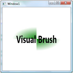
VisualBrush is a new addition to the brush types since GDI+. A VisualBrush is used to fill UI elements. The following code uses a VisualBrush to fill a rectangle. I will cover VisualBrush object, its methods and properties in more details in my seperate article.
<Rectangle Width="200" Height="100">

<Rectangle.Fill>

<VisualBrush TileMode="Tile">

<VisualBrush.Visual>

<StackPanel>

<StackPanel.Background>

<DrawingBrush>

<DrawingBrush.Drawing>

<GeometryDrawing>

<GeometryDrawing.Brush>

<RadialGradientBrush>

<GradientStop Color="Green" Offset="0.0" />

<GradientStop Color="White" Offset="1.0" />

</RadialGradientBrush>

</GeometryDrawing.Brush>

<GeometryDrawing.Geometry>

<GeometryGroup>

<RectangleGeometry Rect="0,0,50,50" />

<RectangleGeometry Rect="50,50,50,50" />

</GeometryGroup>

</GeometryDrawing.Geometry>

</GeometryDrawing>

</DrawingBrush.Drawing>

</DrawingBrush>

</StackPanel.Background>

<TextBlock FontSize="14pt" FontWeight="Bold" Margin="10">Visual Brush</TextBlock>

</StackPanel>

</VisualBrush.Visual>

</VisualBrush>

</Rectangle.Fill>

</Rectangle>

Figure 5. Rectangle filled with a visual brush
Learn more about Visual Brushes here: Visual Brush in WPF by Raj Kumar.
6. Image Brush
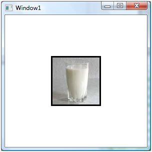
An image brush uses an image as fill color to fill graphics objects such as a recntagle, ellipse, and path. The <ImageBrush/> represents the image brush in XAML. The BitmapSource property represents the image used to fill the brush.
For example, the following code fills a rectangle with an ImageBrush.
<Rectangle Width="100" Height="100" Stroke="Black" StrokeThickness="3">

<Rectangle.Fill>

<ImageBrush ImageSource="Milk.jpg"/>

</Rectangle.Fill>

</Rectangle>

Image 6. Rectangle with an image brush.
Summary
In this article, I discussed brushes available in XAML and WPF model. Clearly, there have been some improvements and additions in brushes in XAML and WPF model since GDI+.
No comments:
Post a Comment