Friday, March 11, 2011

Canvas

The Canvas panel is the layout option closest to traditional graphical environments. You specify where elements go using coordinate positions. As with the rest of the Windows Presentation Foundation, these coordinates are device-independent units of 1/96 inch relative to the upper-left corner.

You may have noticed that elements themselves have no X or Y or Left or Top property. When using a Canvas panel, you specify the location of child elements with the static methods Canvas.SetLeft and Canvas.SetTop. Like the SetDock method defined by DockPaneland the SetRow, SetColumn, SetRowSpan, and SetColumnSpan methods defined by GridSetLeft and SetTop are associated with attached properties defined by the Canvas class. If you'd like, you can alternatively use Canvas.SetRight or Canvas.SetBottom, to specify the location of the right or bottom of the child element relative to the right or bottom of the Canvas.

Some of the Shapes classesspecifically, Line, Path, Polygon, and Polylinealready contain coordinate data. If you add these elements to the Children collection of a Canvas panel and don't set any coordinates, they will be positioned based on the coordinate data of the element. Any explicit coordinate position that you set with SetLeft or SetTop is added to the coordinate data of the element.

Many elements, such as controls, will properly size themselves on a Canvas. However, some elements will not (for example, the Rectangle and Ellipse classes), and for those you must assign explicit Width and Height values. It is also common to assign the Width and Height properties of the Canvas panel itself.

It's also possibleand often desirableto overlap elements on a Canvas panel. As you've seen, you can put multiple elements into the cells of a Grid, but the effect is often difficult to control. With Canvas, the layering of elements is easy to control and predict. The elements added to the Children collection earlier are covered by those added later.

//////

DockPanel (Code)

WrapPanel (CODE)

The panel most similar to StackPanel is WrapPanel. During the years that the Windows Presentation Foundation was being designed and created, the WrapPanel actually preceded the StackPanel. The WrapPanel displays rows or columns of elements and automatically wraps to the next row (or column) if there's not enough room. It sounds quite useful, but it turned out that developers were mostly using WrapPanel without the wrapping. These developers didn't know it at the time, but they really wanted a StackPanel.

WrapPanel is useful when you need to display an unknown number of items in a two-dimensional area. (Think of it as Windows Explorer in non-detail view.) It's likely that all these items will be the same size. WrapPanel doesn't require that, but it has ItemHeight and ItemWidth properties that you can use to enforce uniform height or width. The only other property that WrapPanel defines is Orientation, which you use the same way as for StackPanel.

It is difficult to imagine an application of WrapPanel that doesn't also involve ScrollViewer.  Lets see example with both:

//INSIDE CONSTRUCTOR OF WINDOWS
{
Title = "Explore Directories";

ScrollViewer scroll = new ScrollViewer();
Content = scroll;

WrapPanel wrap = new WrapPanel();
scroll.Content = wrap;

wrap.Children.Add(new FileSystemInfoButton());
}


I named FileSystemInfoButton for the FileSystemInfo object in System.IO. The two classes that derive from FileSystemInfo are FileInfo and DirectoryInfo. If you have a particular object of type FileSystemInfo, you can determine whether it refers to a file or to a directory by using the is operator.

The FileSystemInfoButton class derives from Button and stores a FileSystemInfo object as a field. The class has three constructors. The single-argument constructor is the one used most. It requires an argument of type FileSystemInfo, which it stores as a field. The constructor sets the button's Content to the Name property of this object. That's either the name of a directory or the name of a file. If this object is a DirectoryInfo, the text is bolded.

The parameterless constructor is used only when the program starts up and the window adds the first child to the WrapPanel or any other panel. The parameterless constructor passes a DirectoryInfo object for the My Documents directory to the single-argument constructor.


//////Contd////

GroupBox

Traditionally, a group of mutually exclusive radio buttons are children of a group box, which is a control with a simple outline border and a text heading. In the Windows Presentation Foundation, this is the GroupBox control, which is one of three classes that descend from HeaderedContentControl:

Control
---ContentControl
------HeaderedContentControl
---------Expander
---------GroupBox
---------TabItem

Because HeaderedContentControl derives from ContentControl, these controls have a Content property. The controls also have a Header property, which (like Content) is of type object. GroupBox adds nothing to HeaderedContentControl. Use the Header property to set the heading at the top of the GroupBox. Although this heading is customarily text, you can really make it whatever you want. Use Content for the interior of the GroupBox. You'll probably want to put a StackPanel in there.

//IN WINDOWS CONSTRUCTOR
{
Title = "Tune the Radio";
SizeToContent = SizeToContent.WindowandHeight;

GroupBox group = new GroupBox();
group.Header = "Window Style";
group.Margin = new Thickness(96);
group.Padding = new Thickness(5);
Content = group;
//
StackPanel stack = new StackPanel();
group.Content = stack;
//
stack.Children.Add( CreateRadioButton("No border or caption",
WindowStyle.None));
stack.Children.Add( CreateRadioButton("Single-border window",
WindowStyle.SingleBorderWindow));
stack.Children.Add(CreateRadioButton("3D-border window",
WindowStyle.ThreeDBorderWindow));
stack.Children.Add( CreateRadioButton("Tool window",
WindowStyle.ToolWindow));
//
AddHandler(RadioButton.CheckedEvent, new RoutedEventHandler(
RadioOnChecked));

}//End THE CONSTRUCTOR
RadioButton CreateRadioButton(string strText, WindowStyle winstyle)
{
RadioButton radio = new RadioButton();
radio.Content = strText;
radio.Tag = winstyle;
radio.Margin = new Thickness(5);
radio.IsChecked = (winstyle ==WindowStyle);

return radio;
}
//
void RadioOnChecked(object sender,RoutedEventArgs args)
{
RadioButton radio = args.Source as RadioButton;
WindowStyle = (WindowStyle)radio.Tag;
}


The checking and unchecking of sibling radio buttons happens automatically from either the mouse or keyboard. When you're using the keyboard, the cursor movement keys change the input focus among the sibling radio buttons. The space bar checks the currently focused button. All the program needs to do is monitor which button is being checked. (Some programs might also need to know when a button is losing its check mark.) It is usually most convenient to use the same event handler for sibling radio buttons. When writing code for the event handler, keep in mind that the IsChecked property has already been set.

It could be that you have a bunch of sibling radio buttons that comprise two or more mutually exclusive groups. To distinguish between these groups, use the GroupName property defined by RadioButton. Set GroupName to a unique string for each group of mutually exclusive buttons, and the multiple groups will be automatically checked and unchecked correctly. You can use the same GroupName property in your event handler to determine which group of buttons is affected.

Putting multiple elements into buttons

The following program creates a single button, but the button contains a StackPanel that has four children: an Image, a Label, and two Polyline objects. (Polyline inherits from Shape.)

Title = "Design a Button";

// Create a Button as content of the

Button btn = new Button();
btn.HorizontalAlignment =HorizontalAlignment.Center;
btn.VerticalAlignment =VerticalAlignment.Center;
btn.Click += ButtonOnClick;
Content = btn;

// Create a StackPanel as content of button
StackPanel stack = new StackPanel();
btn.Content = stack;

// Add a Polyline to the StackPanel.
stack.Children.Add(ZigZag(10));

// Add an Image to the StackPanel.
Uri uri = new Uri("pack://application:,,books.ICO"); // 32-pixels
BitmapImage bitmap = new BitmapImage(uri);
Image img = new Image();
img.Margin = new Thickness(0, 10, 0, 0);
img.Source = bitmap;
img.Stretch = Stretch.None;
stack.Children.Add(img);

// Add a Label to the StackPanel.
Label lbl = new Label();
lbl.Content = "_Read books!";
lbl.HorizontalContentAlignment =HorizontalAlignment.Center;
stack.Children.Add(lbl);

// Add another Polyline to the stackpanel
stack.Children.Add(ZigZag(0));

}

Polyline ZigZag(int offset)
{
Polyline poly = new Polyline();
poly.Stroke = SystemColors.ControlTextBrush;
poly.Points = new PointCollection();

for (int x = 0; x <= 100; x += 10)
poly.Points.Add(new Point(x, (x +offset)% 20));
return poly;
}

void ButtonOnClick(object sender,RoutedEventArgs args)
{
MessageBox.Show("The button has been clicked", Title);
}

Viewbox

Scrollbars represent the traditional solution for fitting more elements than space allows. The Windows Presentation Foundation offers another solution called the Viewbox.

ScrollViewer

The ScrollViewer has two properties that govern the visibility of the vertical and horizontal scroll bars. By default, the VerticalScrollBarVisibility property is the enumeration member ScrollBarVisibility.Visible, which means that the scroll bar is always visible, but it's inactive when it's not needed.

The default setting of the HorizontalScrollBarVisibility property is ScrollBarVisibility.Disabled, which means that the scroll bar is never visible.

Another option is ScrollBarVisibility.Auto, which means that the scroll bar appears only when it's needed. You might try setting the VerticalScrollBar property to this member and also decrease the number of buttons to something that can fit on your screen. As you make the window tall enough for the vertical scroll bar to disappear, you'll notice that all the buttons get wider because they have additional space in which to stretch! (Of course, you can avoid that effect by setting the HorizontalAlignment property of the buttons to HorizontalAlignment.Center.)

You can set the HorizontalScrollBarVisibility property to ScrollBarVisibility.Visible or ScrollBarVisibility.Auto. Now when you make the window too narrow for the buttons, a horizontal scroll bar lets you scroll the right sides into view. Without a horizontal scroll bar, when you make the window narrow, the ScrollViewer gives the StackPanel a narrower width. A very narrow StackPanel makes the buttons less wide, and button content is truncated. With a horizontal scroll bar, the StackPanel gets the width it needs.

Wednesday, March 9, 2011

StackPanel (Code)

As discussed here, we now discuss StackPanel programatically :

The following program sets the Content property of its window to a StackPanel and then creates 10 buttons that become children of the panel.
StackPanel stack = new StackPanel();
Content = stack;
Random rand = new Random();

for (int i = 0; i < 10; i++)
{
Button btn = new Button();
btn.Name = ((char)('A' + i)).ToString();
btn.FontSize += rand.Next(10);
btn.Content = "Button " + btn.Name + " says 'Click me'";
btn.Click += ButtonOnClick;
stack.Children.Add(btn);
}

Layout (Code)

Controls that derive from the ContentControl class (such as Window, Button, Label, and ToolTip) have a property named Content that you can set to almost any object. Commonly, this object is either a string or an instance of a class that derives from UIElement. The problem is you can set Content to only one object, which may be satisfactory for simple buttons, but is clearly inadequate for a window.
Fortunately, the Windows Presentation Foundation includes several classes designed specifically to alleviate this problem. These are collectively known as panels, and the art and science of putting controls and other elements on the panel is known as layout.
Panels derive from the Panel class. This partial class hierarchy shows the most important derivatives of Panel:
UIElement
    FrameworkElement
         Panel (abstract)
                Canvas
                DockPanel
                Grid
                StackPanel
                UniformGrid
                WrapPanel
The panel is a relatively recent concept in graphical windowing environments. Traditionally, a Windows program populated its windows and dialog boxes with controls by specifying their precise size and location. The Windows Presentation Foundation, however, has a strong commitment to dynamic layout (also known as automatic layout). The panels themselves are responsible for sizing and positioning elements based on different layout models. That's why a variety of classes derive from Panel: Each supports a different type of layout.
Panel defines a property named Children used to store the child elements. The Children property is an object of type UIElementCollection, which is a collection of UIElement objects. Thus, the children of a panel can be Image objects, Shape objects, TextBlock objects, and Control objects, just to mention the most popular candidates. The children of a panel can also include other panels. Just as you use a panel to host multiple elements in a window, you use a panel to host multiple elements in a button or any other ContentControl object.

Although automatic layout is a crucial feature in the Windows Presentation Foundation, you can't use it in a carefree way. Almost always, you'll have to use your own aesthetic sense in tweaking certain properties of the elements, most commonly HorizontalAligment, VerticalAlignment, Margin, and Padding.
Looking at them 1 by 1: 
StackPanel

File Open and File Save dialog boxes


RichTextBox

The RichTextBox is much more complex than the TextBox because it stores text that could have a variety of different character and paragraph formatting. If you're familiar with previous Windows controls similar to RichTextBox, you might naturally assume that the control stores text in the Rich Text Format (RTF), a file format that dates from the mid-1980s and which was intended to provide an interchange format among word processing programs. The WPF version of RichTextBox certainly supports RTF (and plain text as well) but it also supports an XML-based file format that is a subset of the Extensible Application Markup Language (XAML) supported by WPF.

Formatted text gets into and out of the RichTextBox through the Document property. This Document property is of type FlowDocument, and the following code creates a TextRange object that encompasses the entire document:

TextRange range = new TextRange(flow.ContentStart, flow.ContentEnd);
The TextRange class defines two methods named Load and Save. The first argument is a Stream; the second is a string describing the desired data format. For this second argument it's easiest to get those strings from static members of the DataFormats class. With the RichTextBox, you can use DataFormats.Text, DataFormats.Rtf, DataFormats.Xaml, and DataFormats.XamlPackage, which is actually a ZIP file that contains binary resources the document might require. This program is hard-coded to use DataFormats.Xaml. (The program can't load any arbitrary XAML file, however.) You may want to look at these files to get a glimpse of the format of documents under the Windows Presentation Foundation.


TextBox and RichTextBox (Code)

Speaking of the TextBox control, the Windows Presentation Foundation supports the two we've come to expect:
Control
       TextBoxBase (abstract)
                  TextBox
                  RichTextBox
Although the TextBox has content, it is not considered a ContentControl because the content is always text. Instead it has a Text property that lets you set an initial string or obtain the string that the user typed.
Because TextBox derives from Control, you can specify the background and foreground brushes used in the control, as well as the font. However, at any time, all the text that appears in a particular TextBox will always be the same color and use the same font. The RichTextBox control lets the program (and the user) apply various character and paragraph formatting to different parts of the text. The difference between TextBox and RichTextBox is the same as the difference between Windows Notepad and Windows WordPad.
By default, a TextBox control allows entry of a single line of text.

By default the TextBox isn't interested in the Enter key. If you set :
Label lbl = new Label();
lbl.Content = "File _name:";
The single-line edit control becomes a multiline edit control and now handles carriage returns.

Label (Code)

Traditionally the Label control has been the standard way to display short text strings in forms and dialog boxes. For example, here's a label that might appear in a File Open dialog:

Label lbl = new Label();
lbl.Content = "File _name:"; 
 
With versatile elements such as TextBlock, the Label control would seem to be obsolete, but it's really not, and the key to its longevity is the ability to use underscores in text that you assign to the Content property. In a File Open dialog box, pressing Alt+N shifts the input focus not to the labelbecause labels are commonly non-focusablebut to the control after the label, which is probably a TextBox control that lets the user enter and edit text. Thus, labels continue to maintain their role as assistants in keyboard navigation.


ToolTip property

The BindTheButton program also includes a ToolTip object that is set to the ToolTip property of the Button. The text appears when the mouse cursor pauses over the button. The ToolTip property is defined by FrameworkElement, so you can attach a tooltip to other elements as well as controls. Like ButtonBase and Windows, ToolTip derives from ContentControl, so you can use formatted text in the ToolTip, and even pictures if you really want to mess with the heads of your users.
If you'd like to see a ToolTip with an image, go back to the ImageTheButton program and insert the following four lines at the end of the constructor:
Button btn = new Button();
btn.Content = "Don't Click Me!";
ToolTip tip = new ToolTip();
tip.Content = img;
btn.ToolTip = tip;

Tuesday, March 8, 2011

Toggle Buttons

Both CheckBox and RadioButton are considered types of "toggle" buttons, as is clear from a complete view of the classes that descend from ButtonBase:

Control
--ContentControl
------ButtonBase (abstract)
------------Button
-------------GridViewColumnHeader
-------------RepeatButton
-------------ToggleButton
---------------------CheckBox
---------------------RadioButton

ToggleButton is not abstract, so you can also create an object of type ToggleButton, which looks just like a regular button except that it toggles on and off.

Consider the example :

ToggleButton btn = new ToggleButton();
btn.Content = "Can _Resize";
btn.HorizontalAlignment =HorizontalAlignment.Center;
btn.VerticalAlignment =VerticalAlignment.Center;
//win is the Window reference in which toggle button lies
btn.IsChecked = (win.ResizeMode ==ResizeMode.CanResize);
btn.Checked += ButtonOnChecked;
btn.Unchecked += ButtonOnChecked;

//Event handler ButtonOnChecked
void ButtonOnChecked(object sender,RoutedEventArgs args)
{
ToggleButton btn = sender as ToggleButton;
win.ResizeMode = (bool)btn.IsChecked ? ResizeMode.CanResize : ResizeMode.NoResize;
}


ToggleTheButton uses the button to switch the ResizeMode property of the window between ResizeMode.CanResize and ResizeMode.NoResize. The button automatically toggles itself on and off as the user clicks it. The IsChecked property indicates the current setting. Notice that the program initializes IsChecked to true if ResizeMode is initially ResizeMode.CanResize and false otherwise. Two events named Checked and Unchecked are triggered as the button is checked and unchecked. You can attach the same event handler to both events and simply use the IsChecked property to distinguish them, which is exactly what ToggleTheButton does.

Notice that the IsChecked property must be cast to a bool before being used in the C# conditional operator. The IsChecked property is actually a nullable bool, and can take on values of true, false, and null. If you set the IsThreeState property of ToggleButton to true, you can set IsChecked to null to display a third, "indeterminate" state of the button. For example, an Italic button in a word processing program might use this indeterminate state if the currently selected text has a mix of both italic and non-italic characters. (However, if the currently selected text is in a font that doesn't allow italics, the program would disable the Italic button by setting its IsEnabled property to false.)

The CheckBox class adds almost nothing to ToggleButton. You can create a CheckBox in this program just by replacing the button creation code with this:

CheckBox btn = new CheckBox();


You don't need to change the event handler. The program works the same except that the button looks different. You could also change ToggleTheButton's button to a RadioButton, but the program wouldn't work properly. You cannot uncheck a radio button by manually clicking it.

Because a ToggleButton or a CheckBox essentially represents the value of a Boolean, it makes sense that a particular toggle button be associated with a Boolean property of some object. This is called data binding, and it is such an important part of the Windows Presentation Foundation that Chapter 23 is devoted to the topic.

A ToggleButton used with data binding doesn't need to have its IsChecked property initialized, or have handlers installed for the Checked and Unchecked events. What's required instead is a call to the SetBinding method, which the button inherits from the FrameworkElement class. For a ToggleButton or CheckBox object, the call is typically something like this:

btn.SetBinding(ToggleButton.IsCheckedProperty, "SomeProperty");


where the second argument is a string with the name of a property you want associated with the IsChecked state of the button. You specify the object that "SomeProperty" belongs to with the DataContext property of Button.

The first argument to the SetBinding method probably looks even stranger than the second argument. It refers not to the IsChecked property of a ToggleButton object, but instead to something called IsCheckedProperty that appears to be a static member of the ToggleButton class.

ToggleButton does indeed define a static field named IsCheckedProperty that is an object of type DependencyProperty. Chapter 8 is devoted in its entirety to dependency properties. For now, think of it just as a convenient way to refer to a particular property defined by ToggleButton.

So, to what Boolean property do we want to bind the ToggleButton? One convenient Boolean is the Topmost property of the window. As you'll recall, if Topmost is set to true, the window always appears in the foreground of other windows. The SetBinding call looks like this:

btn.SetBinding(ToggleButton.IsCheckedProperty, "Topmost");


The data binding won't try to guess which object in the program is the one whose Topmost property you're referring to, so you need to specify that object by setting the DataContext property of the button to the window object:

btn.DataContext = this;


Command Property

Installing a handler for the button's Click event is certainly the most traditional way for a program to be notified when the user clicks a button. However, it could be that a particular operation in your program can be triggered through several sourcesperhaps a menu item, a toolbar item, and a button. Perhaps you even implement a scripting language that can trigger this same operation. It might make more sense to route all these controls through a single point.

This is the idea behind a property named Command, which is defined by the ButtonBase class and some other classes, including MenuItem.

For common commands, you set the Command property of the Button object equal to a static property of the classes ApplicationCommands, ComponentCommands, MediaCommands, NavigationCommands, or EditingCommands. The first four of these classes are located in the System.Windows.Input namespace; the last is in System.Windows.Documents. The static properties of these classes are all of type RoutedUICommand. You can also create your own objects of type RoutedUICommand.

For example, if you wanted a particular button to perform a clipboard Paste command, you would set the Command property like so:

btn.Command = ApplicationCommands.Paste;


It's not required, but you may also want to set the button text to the standard text for that command:

btn.Content = ApplicationCommands.Paste.Text;


The other step is to associate this particular Paste command with event handlers. This association is called a binding, and it's one of several types of bindings you'll find in the Windows Presentation Foundation. The UIElement class defines (and the Control and Window classes inherit) a property named CommandBindings, which is a collection of CommandBinding objects. You'll probably use the CommandBindings collection of the window, so the statement looks something like this:

CommandBindings.Add(new CommandBinding(ApplicationCommands.Paste,
PasteOnExecute, PasteCanExecute));


PasteOnExecute and PasteCanExecute are two event handlers that are located in your program. (You can name them whatever you want.) In the PasteOnExecute handler, you carry out the Paste command. Sometimes, however, your program can't carry out a Paste command because the clipboard doesn't contain data in the format you want. That's the purpose of the PasteCanExecute handler. This handler checks the clipboard for data of the proper format. If the data isn't available, the handler can set a flag and the Button will automatically be disabled.

If this program also has a menu item for Paste, you just need to assign the Command property of the menu item to ApplicationCommands.Paste, and the same binding will apply.


Button btn = new Button();
btn.HorizontalAlignment = HorizontalAlignment.Center;
btn.VerticalAlignment =VerticalAlignment.Center;
btn.Command = ApplicationCommands.Paste;
btn.Content = ApplicationCommands.Paste.Text;

// Bind the command to the event handlers.
CommandBindings.Add(new CommandBinding
(ApplicationCommands.Paste,
PasteOnExecute,
PasteCanExecute));


Writing the handlers:


void PasteOnExecute(object sender,ExecutedRoutedEventArgs args)
{
Title = Clipboard.GetText();
}
//2nd event handler
void PasteCanExecute(object sender, CanExecuteRoutedEventArgs args)
{
args.CanExecute = Clipboard.ContainsText();
}


The two event handlers PasteOnExecute and PasteCanExecute use static methods from the Clipboard class (located in System.Windows). The static GetText and ContainsText methods both exist in overloaded versions that allow you to be specific about the type of text you wantincluding comma-separated format, HTML, RTF, Unicode, or XAMLbut this program doesn't use those text types. The text it gets from the clipboard is just used to set the window's Title property. Since you may want to experiment with this program a bit, the last method in the program lets you click anywhere in the window to restore the Title text.


Before running the program, you might want to copy some text to the clipboard from Notepad or another text-based application (even Visual Studio) just so the program has something to work with. You'll discover that the button responds not only to the normal keyboard and mouse input, but also to Ctrl+V, the standard keyboard shortcut for Paste. That's one of the benefits of using a command binding rather than just handling the Click event.

Now copy a bitmap into the clipboard. No need to run Paint or PhotoShop! Just press the Print Screen key to copy the screen image into the clipboard. Whenever there's a change in the clipboard, any bound can-execute event handlers (such as PasteCanExecute) are called so that the handler has the opportunity to properly set the CanExecute property of the event arguments. The button is immediately disabled. Now copy some text into the clipboard. The button is enabled again. Behind the scenes, the command binding changes the IsEnabled property that Button inherits from UIElement.

Resources in wpf

This word resource is used in a couple different ways in the Windows Presentation Foundation. The type of resource I'll show you here can be differentiated as an assembly resource. The resource is a file (generally a binary file) that is made part of the project in Visual Studio and becomes part of an executable or a dynamic-link library.

Don't Set the size on control explicitly


The less explicitly you set the sizes of controls, the happier you'll be. Remember that WPF will try to size the content to fit the individual user's screen resolution. Setting sizes of controls to specific values countermands this.

FrameworkElement vs. FrameworkContentElement


FrameworkElement (FE) derives from UIElement.  FrameworkContentElement (FCE) derives from ContentElement.  Since the framework is not built on a language that supports multiple inheritance (and thank god for that!), the divergence was necessary.  There are parts of ContentElement that you wouldn’t want in every FE and there are parts of UIElement that you wouldn’t want in every FCE.
FCE basically exists to support the text formatting engine (which can be found in the MS.Internal.Text namespace).  There are a few non-text classes that derive from FCE, but they do this just to be lightweight.
The goal was to make the programming experience for dealing with an FE and FCE as similar as possible.  If anything, I think this makes the framework *more* elegant.
You can think of an FCE as having everything an FE has except support for layout/rendering.  Of course, this is no small feature and you certainly would not want that kind of overhead in every text element.  Imagine the perf if you tried to render every textual stroke using WPF’s layout engine… text is far too complex.
True, it’s weird to see the exact same properties, methods, interfaces, events, etc, defined on two completely different base classes.  But I guess my general response is a big shrug.  As long as Microsoft is willing to maintain the code, I don’t have a problem with it.  (And in truth, much of the code shared between the classes is codegen’d anyway during the build process, so its really not that hard for them to maintain… clever chaps!)
Sidenote:  IFE vs. LIFE:  A mnemonic we used to use is “LIFE begins at UIElement”.  That is to say, every UIElement supports Layout, Input, Focus, and Events.  ContentElement gives you everything but the ‘L’.  As such, the intersection of functionality between an FE and FCE is the IFE portion.
I recommend creating a helper class if you want to treat the IFE portion of framework objects in a polymorphic manner.  It’s easy enough to implement…  in fact, you can steal most of the implementation from the internal FrameworkObject class  in fact, you can steal most of the implementation from the internal FrameworkObject class.  :-)
Content Source: Dr. WPF

SizeToContent Property (Window)

The SizeToContent property defined by the Window class causes the window to adjust itself to be just as big as the size of its content. If you're still using the same LinearGradientBrush for foreground and background, you won't be able to see the text. You set the SizeToContent property to a member of the SizeToContent enumeration: Manual (which is the default), Width, Height, or WidthAndHeight. With the latter three, the window adjusts its width, height, or both the size of its contents. This is a very handy property that you'll often use when designing dialog boxes or other forms. When setting a window to the size of its content, you'll often want to suppress the sizing border with the following:

ResizeMode = ResizeMode.CanMinimize;


OR


ResizeMode = ResizeMode.NoResize;


Fonts in wpf

There is no such thing as a Font class in the WPF. But we can have a reference to a FontFamily object. A font family (also known as a type family) is a collection of related typefaces. Under Windows, font families have familiar names such as Courier New, Times New Roman, Arial, Palatino Linotype, Verdana, and, of course, Comic Sans MS.

FontFamily = new FontFamily("Comic Sans MS");
FontSize = 48;


A typeface (also known as a face name) is the combination of a font family and a possible variation, such as Times New Roman Bold, Times New Roman Italic, and Times New Roman Bold Italic. Not every variation is available in every font family, and some font families have variations that affect the widths of individual characters, such as Arial Narrow.

The term font is generally used to denote a combination of a particular typeface with a particular size. The common measurement of fonts is the em size. (The term comes from the size of the square piece of metal type used in olden days for the capital M.) The em size is commonly described as the height of the characters in the Latin alphabetthe uppercase and lowercase letters A through Z without diacritical marksfrom the very top of the ascenders to the bottom of the descenders. However, the em size is not a metrical concept. It is a typographical design concept. The actual size of characters in a particular font could be somewhat greater than or less than what the em size implies.

Commonly, the em size is specified in a unit of measurement known as the point. In traditional typography, a point is 0.01384 inch, but in computer typography, the point is assumed to be exactly 1/72 inch. Thus, a 36-point em size (often abbreviated as a 36-point font) refers to characters that are about 1/2 inch tall.

In the Windows Presentation Foundation, you set the em size you want by using the FontSize property. But you don't use points. Like every measurement in the WPF, you specify the FontSize in device-independent units, which are 1/96 inch. Setting the FontSize property to 48 results in an em size of 1/2 inch, which is equivalent to 36 points.

If you're accustomed to specifying em sizes in points, just multiply the point size by 4/3 (or divide by 0.75) when setting the FontSize property. If you're not accustomed to specifying em sizes in points, you should get accustomed to it, and just multiply the point size by 4/3 when setting the FontSize property.

The default FontSize property is 11, which is 8.25 points. Much of The New York Times is printed in an 8-point type. Newsweek uses a 9-point type. This book has 10-point type.

You can use a full typeface name in the FontFamily constructor:

FontFamily = new FontFamily("Times New Roman Bold Italic");
FontSize = 32;


That's a 24-point Times New Roman Bold Italic font. However, it's more common to use the family name in the FontFamily constructor and indicate bold and italic by setting the FontStyle and FontWeight properties:

FontFamily = new FontFamily("Times New Roman");
FontSize = 32;
FontStyle = FontStyles.Italic;
FontWeight = FontWeights.Bold;

Notice that the FontStyle and FontWeight properties are set to static read-only properties of the FontStyles (plural) and FontWeights (plural) classes. These static properties return objects of type FontStyle and FontWeight, which are structures that have limited use by themselves.

Here's an interesting little variation:

FontStyle = FontStyles.Oblique;


An italic typeface is often stylistically a bit different from the non-italic (or roman) typeface. Look at the lowercase "a" to see the difference. But an oblique typeface simply slants all the letters of the roman typeface to the right. For some font families, you can set a FontStretch property to a static property of the FontStretches class.

Shapes in WPF (code)

Take a look at the namespace System.Windows.Shapes, which contains an abstract class named Shape and six other classes that derive from it. These classes also derive from UIElement by way of FrameworkElement:

Object
--DispatcherObject (abstract)
------DependencyObject
----------Visual (abstract)
--------------UIElement
--------------------FrameworkElement
--------------------------Shape (abstract)
--------------------------------Ellipse
--------------------------------Line
--------------------------------Path
--------------------------------Polygon
--------------------------------Polyline
--------------------------------Rectangle

While Image is the standard way to display raster images, these Shape classes implement simple two-dimensional vector graphics. Eg. lets take ellipse:

Ellipse elips = new Ellipse();
elips.Fill = Brushes.AliceBlue;
elips.StrokeThickness = 24; // 1/4 inch
elips.Stroke = new LinearGradientBrush(Colors.CadetBlue, Colors.Chocolate,
new Point (1, 0), new Point(0, 1));


Neither the Shape class nor the Ellipse class defines any properties to set a size of the ellipse, but the Ellipse class inherits Width and Height properties from FrameworkElement, and these do just fine:

elips.Width = 300;
elips.Height = 300;


Controls in WPF (Code)

In the Windows Presentation Foundation, the term control is somewhat more specialized than in earlier Windows programming interfaces.

In Windows Forms, for example, everything that appears on the screen is considered a control of some sort. In the WPF, the term is reserved for elements that are user interactive, which means that they generally provide some kind of feedback to the user when they are prodded with the mouse or triggered by a keystroke. The TextBlock, Image, and Shape elements all receive keyboard, mouse, and stylus input, but they choose to ignore it. Controls actively monitor and process user input.

The Control class descends directly from FrameworkElement:

Object
--DispatcherObject (abstract)
------DependencyObject
--------Visual (abstract)
------------UIElement
------------------FrameworkElement
------------------------Control

Window derives from Control by way of ContentControl. Properties defined by Control include Background, Foreground, BorderBrush, BorderThickness, and font-related properties, such as FontWeight and FontStretch. (Although TextBlock also has a bunch of font properties, TextBlock does not derive from Control. TextBlock defines those properties itself.)

From Control descend more than 50 other classes, providing programmers with favorites such as buttons, list boxes, scroll bars, edit fields, menus, and toolbars. The classes implementing these controls can all be found in the System.Windows.Controls and System.Windows.Controls.Primitives namespaces, along with other classes that do not derive from Control.

TextBlock

Consider the TextBlock object:

TextBlock txt = new TextBlock();
txt.FontSize = 32; // 24 points

txt.Inlines.Add("This is some ");
txt.Inlines.Add(new Italic(new Run("Italic")));
txt.Inlines.Add(" text, and this is some");
txt.Inlines.Add(new Bold(new Run("Bold")));

txt.Inlines.Add(" text, and let's cap it off some ");
txt.Inlines.Add(new Bold(new Italic(new Run("bold italic"))));
txt.Inlines.Add(" text.");
txt.TextWrapping = TextWrapping.Wrap;


The TextBlock class derives directly from FrameworkElement. It defines a property named Inlines, which is of type InlineCollection, which is a collection of Inline objects.

TextBlock itself is included in the System.Windows.Controls namespace but Inline is part of System.Windows.Documents, and it doesn't even derive from UIElement. Here's a partial class hierarchy showing Inline and some of its descendents:

Object
--DispatcherObject (abstract)
------DependencyObject
----------ContentElement
--------------FrameworkContentElement
--------------------TextElement (abstract)
--------------------Inline (abstract)
------------------------------Run
------------------------------Span
--------------------------------------Bold
--------------------------------------Hyperlink
--------------------------------------Italic
--------------------------------------Underline

Create Image from URI

Image is popular class that inherits from FrameworkElement. Here's the class hierarchy:

Object
--DispatcherObject (abstract)
----DependencyObject
------Visual (abstract)
--------UIElement
------------FrameworkElement
------------------Image

The Image class lets you easily include an image in a document or an application.

Uri uri = new Uri("http://www.images.com/bird.jpg");
BitmapImage bitmap = new BitmapImage(uri);

Image img = new Image();
img.Source = bitmap;


A couple of steps are required to display an image. The program first creates an object of Uri that indicates the location of the bitmap. This is passed to the BitmapImage constructor, which actually loads the image into memory. (Many popular formats are supported, including GIF, TIFF, JPEG, and PNG.) The Image class displays the image in the window.


You can find the Image class in the System.Windows.Controls namespace. Strictly speaking, Image is not considered a control and does not derive from the Control class. But the System.Windows.Controls namespace is so important that I'll include it in most programs from here on. The BitmapImage class is located in the System.Windows.Media.Imaging namespace, which is certainly an important namespace if you're working with bitmaps. However, I won't generally include a using directive for this namespace unless the program requires it.

Alternatively, you can load an image file from a local disk drive. You'll need a fully qualified file name as the argument in the Uri constructor, or you'll need to preface the relative file name with "file://".

Uri uri = new Uri(
System.IO.Path.Combine(
Environment.GetEnvironmentVariable("windir"),"BirdsOnComp.bmp"));


The Environment.GetEnvironmentVariable method retrieves the "windir" environment variable, which is a string like "C:\WINDOWS". The Path.Combine method combines that path name with the file name of the desired bitmap so that I (the lazy programmer) don't have to worry about inserting slashes correctly. You can either preface the Path class with System.IO (as I've done) or include a using directive for that namespace.

Rather than passing the Uri object to the BitmapImage constructor, you can set the Uri object to the UriSource property of BitmapImage. However, it's recommended that you surround the setting of this property with calls to the BeginInit and EndInit methods in BitmapImage:

bitmap.BeginInit();
bitmap.UriSource = uri;
bitmap.EndInit();


As you know, bitmaps have a pixel width and a pixel height, which is to the number of picture elements actually encoded in the file. The BitmapImage class inherits integer read-only PixelWidth and PixelHeight properties from BitmapSource that reveals this information. Bitmaps often (but not always) have embedded resolution information. Sometimes this resolution information is important (a scan of a rare postage stamp) and sometimes it's not (a photo of your postal carrier). The resolution information in dots per inch is available from the read-only double values DpiX and DpiY. The BitmapImage class also includes read-only double properties named Width and Height. These values are calculated with the following formulas:


Without the value of 96 in the numerator, these formulas would give a width and height of the image in inches. The 96 converts inches into device-independent units. The Height and Width properties constitute the metrical size of the bitmap in device-independent units. BitmapImage also inherits from BitmapSource a Format property that provides the color format of the bitmap; for those bitmaps that have a color table, the Palette property gives access to that.

The Image class does not have its own Background and Foreground properties because those properties are defined by the Control class and Image is not derived from Control. The distinction may be a little confusing at first. In earlier Windows application programming interfaces, virtually everything on the screen was considered a control. That is obviously not the case here. A control is really just another visual object, and is characterized mostly by giving feedback to user input. Elements like Image can obtain user input, of course, because all the keyboard, mouse, and stylus input events are defined by UIElement.

The concept of Content

The Window class has more than 100 public properties, and some of themsuch as the Title property that identifies the windoware quite important. But by far the most important property of Window is the Content property. 
You set the Content property of the window to the object you want in the window's client area.
You can set the Content property to a string, you can set it to a bitmap, you can set it to a drawing, and you can set it to a button, or a scrollbar, or any one of 50-odd controls supported by the Windows Presentation Foundation. 
You can set the Content property to just about anything. But there's only one little problem:
You can only set the Content property to one object.
This restriction is apt to be a bit frustrating in the early stages of working with content. Eventually, of course, you'll see how to set the Content property to an object that can play host to multiple other objects. For now, working with a single content object will keep us busy enough.


We've seen that window content can be plain text. But the purpose of the Content property is not to display simple unformatted text. No, no, no, no, no. What the Content property really wants is something more graphical in nature, and that's an instance of any class that derives from UIElement.
UIElement is an extremely important class in the Windows Presentation Foundation. This is the class that implements keyboard, mouse, and stylus handling. The UIElement class also contains an important method named OnRender. The OnRender method is invoked to obtain the graphical representation of an object.
As far as the Content property goes, the world is divided into two groups of objects: Those that derive from UIElement and those that do not. In the latter group, the object is displayed with ToString; in the former group, it's displayed with OnRender. Classes that derive from UIElement (and their instantiated objects) are often referred to collectively as elements.
The only class that inherits directly from UIElement is FrameworkElement, and all the elements you'll encounter in the Windows Presentation Foundation derive from FrameworkElement. In theory, UIElement provides the necessary structure of user interface events and screen rendering that can support various programming frameworks. The Windows Presentation Foundation is one such framework and consists of all the classes that derive from FrameworkElement. In a practical sense, you probably won't make much of a distinction between the properties, methods, and events defined by UIElement and those defined by FrameworkElement.
 
One popular class that inherits from FrameworkElement is Image. Here's the class hierarchy:
Object
--DispatcherObject (abstract)
------DependencyObject
----------Visual (abstract)
------------------UIElement
----------------------FrameworkElement
----------------------------Image
The Image class lets you easily include an image in a document or an application.

Monday, March 7, 2011

Visual Brush in WPF (XAML)

Introduction

In this article describes how to use a VisualBrush in WPF. VisualBrush is a new addition to the brush types since GDI+. A VisualBrush is used to fill UI elements.

With a VisualBrush, you can define a simple or complex UI element and assign it to the VisualBrush.Visual property. Then you can paint other parts of your screen with this conglomerate brush. You get a number of performance benefits from the VisualBrush because WPF can use a copy of the the pixels it has already rendered.
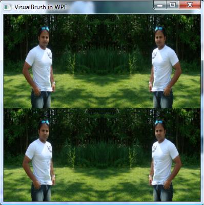
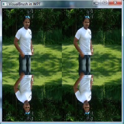
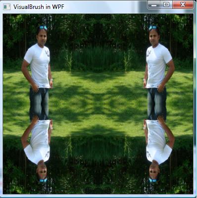
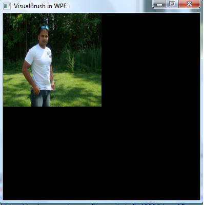
VisualBrush has five TileMode properties:

  1. FlipX
  2. FlipY
  3. FlipXY
  4. None
  5. Tile

Getting Started

The VisualBrush element of XAML represents a Visual Brush. You treat this brush as other brushes. For example, you can set this brush as a background property of a window or a control. The TileMode property is used to set the tile of the brush. The Visual property of VisualBrush sets the visual and it can be an image. For example, the following code snippet creates a VisualBrush and sets its FlipX and Visual properties.


<VisualBrush TileMode="FlipX" Viewport="0,0,0.5,0.5">
<VisualBrush.Visual>
<Image Source="Raj 039.JPG"></Image>
</VisualBrush.Visual>
</VisualBrush>


The following code snippet sets the visual property to an Image.

FlipX:

<Window
x:Class="WPF_VisualBrush.Window1"

xmlns="http://schemas.microsoft.com/winfx/2006/xaml/presentation"
xmlns:x="http://schemas.microsoft.com/winfx/2006/xaml"
Title="VisualBrush in WPF" Height="400" Width="400">
<Window.Background>
<VisualBrush TileMode="FlipX" Viewport="0,0,0.5,0.5">
<VisualBrush.Visual>
<Image Source="Raj 039.JPG"></Image>
</VisualBrush.Visual>
</VisualBrush>
</Window.Background>
</Window>


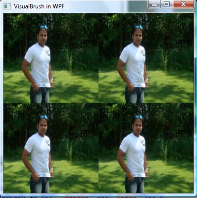
The output looks like Figure 1.

Figure1


FlipY:


<Window x:Class="WPF_VisualBrush.Window1"
xmlns="http://schemas.microsoft.com/winfx/2006/xaml/presentation"
xmlns:x="http://schemas.microsoft.com/winfx/2006/xaml"
Title="VisualBrush in WPF" Height="400" Width="400">
<Window.Background>
<VisualBrush TileMode="FlipY" Viewport="0,0,0.5,0.5">
<VisualBrush.Visual>
<Image Source="Raj 039.JPG"></Image>
</VisualBrush.Visual>
</VisualBrush>
</Window.Background>
</Window>


The FlipY output looks like Figure 2.

Figure 2.

FlipXY:

<Window x:Class="WPF_VisualBrush.Window1"
xmlns="http://schemas.microsoft.com/winfx/2006/xaml/presentation"
xmlns:x="http://schemas.microsoft.com/winfx/2006/xaml"
Title="VisualBrush in WPF" Height="400" Width="400">
<Window.Background>
<VisualBrush TileMode="FlipXY" Viewport="0,0,0.5,0.5">
<VisualBrush.Visual>
<Image Source="Raj 039.JPG"></Image>
</VisualBrush.Visual>
</VisualBrush>
</Window.Background>
</Window>


The FlipXY output looks like Figure 3.


Figure 3.
None:

<Window x:Class="WPF_VisualBrush.Window1"
xmlns="http://schemas.microsoft.com/winfx/2006/xaml/presentation"
xmlns:x="http://schemas.microsoft.com/winfx/2006/xaml"
Title="VisualBrush in WPF" Height="400" Width="400">
<Window.Background>
<VisualBrush TileMode="None" Viewport="0,0,0.5,0.5">
<VisualBrush.Visual>
<Image Source="Raj 039.JPG"></Image>
</VisualBrush.Visual>
</VisualBrush>
</Window.Background>
</Window>


The None (no visual brush) output looks like Figure 4.

Figure 4.
Tile:

<Window x:Class="WPF_VisualBrush.Window1"
xmlns="http://schemas.microsoft.com/winfx/2006/xaml/presentation"
xmlns:x="http://schemas.microsoft.com/winfx/2006/xaml"
Title="VisualBrush in WPF" Height="400" Width="400"> <Window.Background>
<VisualBrush TileMode="Tile" Viewport="0,0,0.5,0.5">
<VisualBrush.Visual>
<Image Source="Raj 039.JPG"></Image>
</VisualBrush.Visual>
</VisualBrush>
</Window.Background>
</Window>


The Tile output looks like Figure 5.


Figure 5.

The Visual Brush can be applied to any control. It doesn't have to be a Windows as shown in my previous example. It can be a button, a rectangle, or a TextBox.

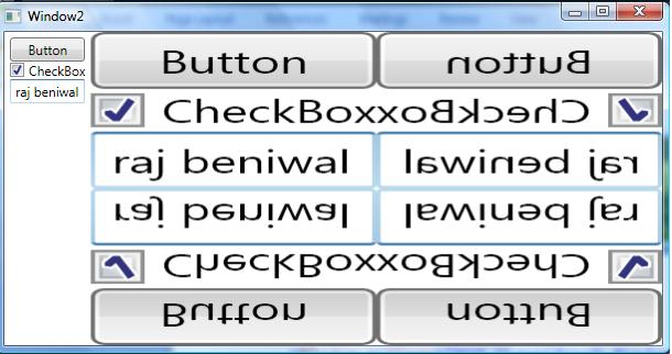
Let's see one more example with a Rectangle. In the following code snippet, I will a rectangle with a Visual Brush and set its TileMode property.

<Window x:Class="WPF_VisualBrush.Window2"
xmlns="http://schemas.microsoft.com/winfx/2006/xaml/presentation"
xmlns:x="http://schemas.microsoft.com/winfx/2006/xaml"
Title="Window2">
<DockPanel>
<StackPanel Margin="5" x:Name="Panel">
<Button>Button</Button>
<CheckBox>CheckBox</CheckBox>
<TextBox></TextBox>
</StackPanel>
<Rectangle>
<Rectangle.Fill>
<VisualBrush TileMode="FlipXY" Viewport="0,0,0.5,0.5" Visual="{Binding ElementName=Panel}"></VisualBrush>
</Rectangle.Fill>
</Rectangle>
</DockPanel>
</Window>


The output generates the following Figure.


Summary
In this article, we discussed how to use a VisualBrush in WPF.